.png)
Zara’s beautiful, edgy, and editorial looks attract young people looking for trendy clothing. Quick to follow current fashion trends, it is always changing and adjusting based on consumer interests. The website is meant to mimic a fashion magazine. With sequential full-screen visuals, minimal text, and hard edges, the site establishes a simplistic yet bold mood. And the use of various poses and props when photographing clothing further creates an editorial feel.
Zara’s website is notorious for its poor user experience. While the site has a distinct and beautiful aesthetic, the usability issues are ultimately doing a great disservice to users and the brand’s business.
The purpose of this project was to conduct research on the Zara website to identify where the major usability issues were occurring. By defining the user pain points, this research could provide the necessary information for a redesign.
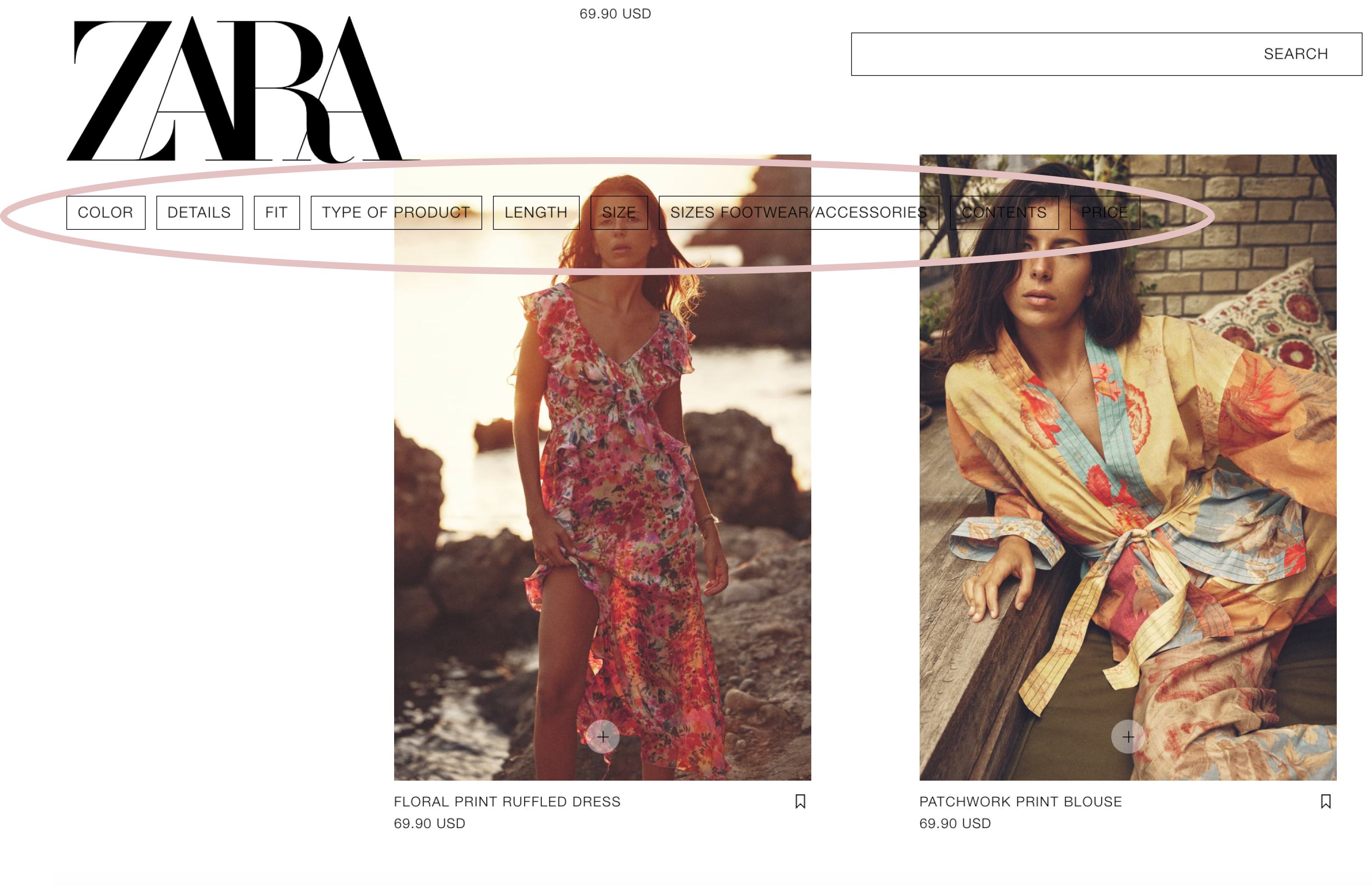
Before beginning my research, I visited the site as a user to see what stood out to me. The main takeaways from my first impression visit were:
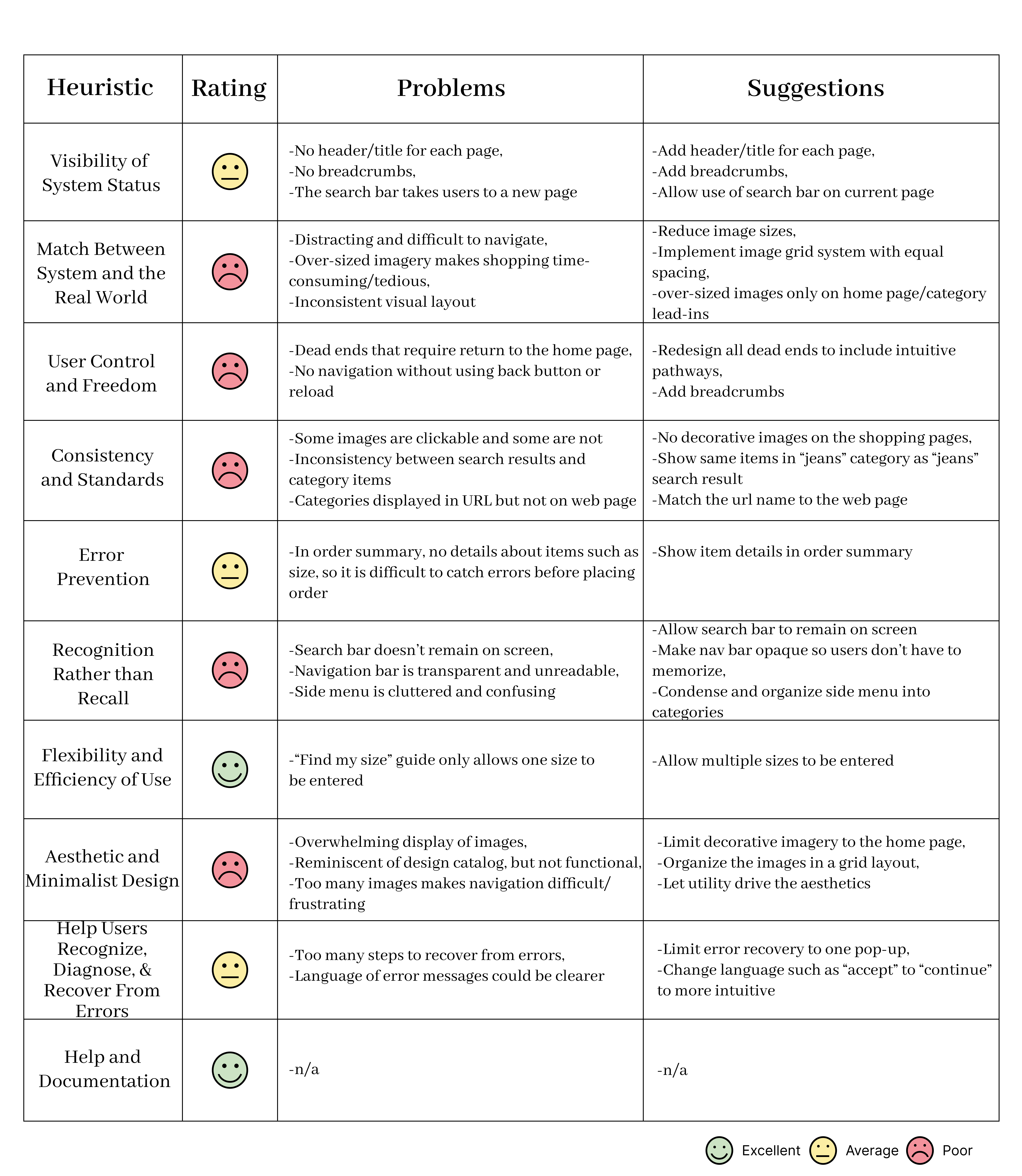
I began research by conducting a heuristic evaluation to see which heuristics were being followed successfully and which were being violated. I used the 10 Usability Heuristics for User Interface Design as defined by the Nielsen Norman Group. I gave the website’s use of each heuristic a rating of excellent, average, or poor. I also noted where the successes and violations were occurring and how they could be improved.
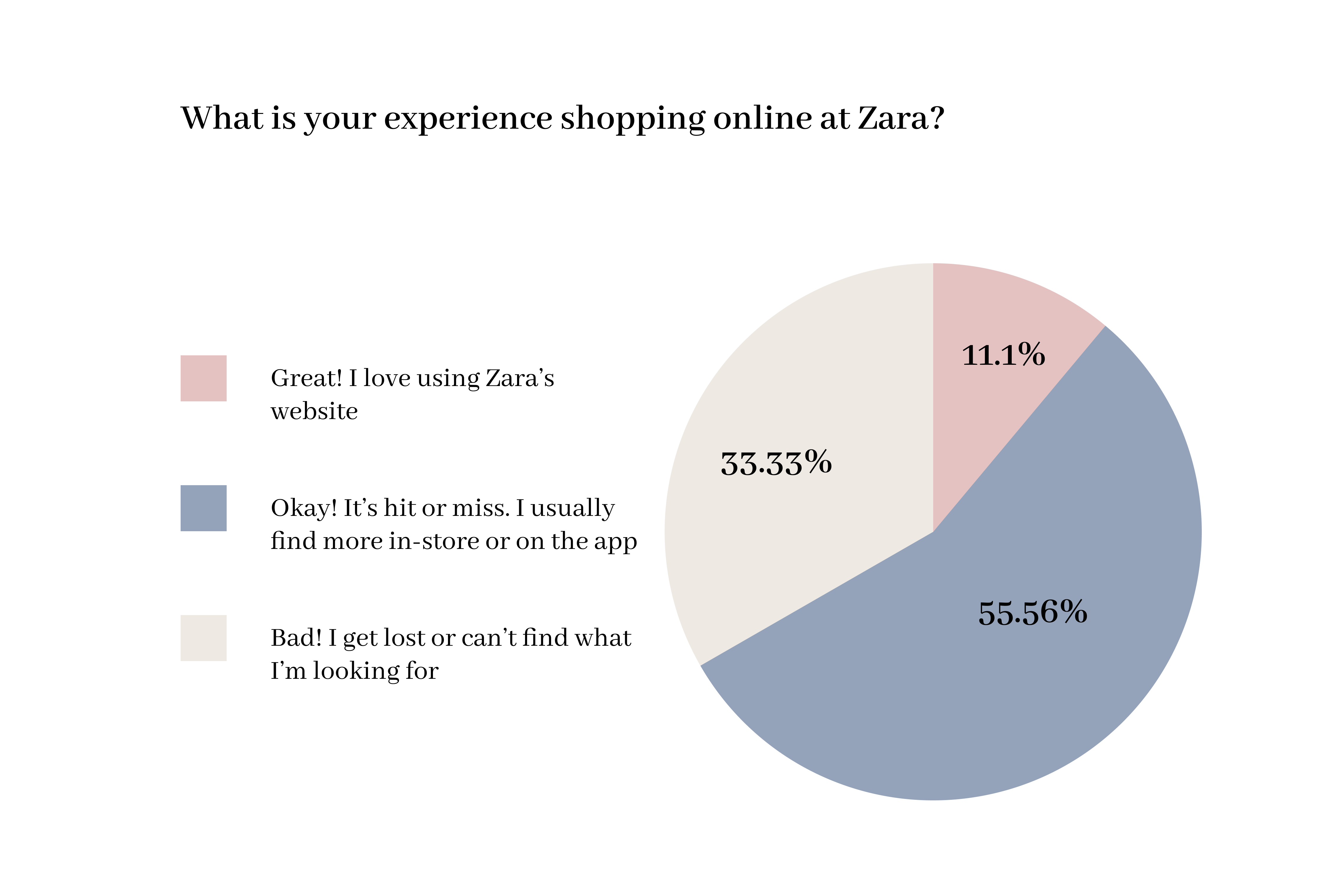
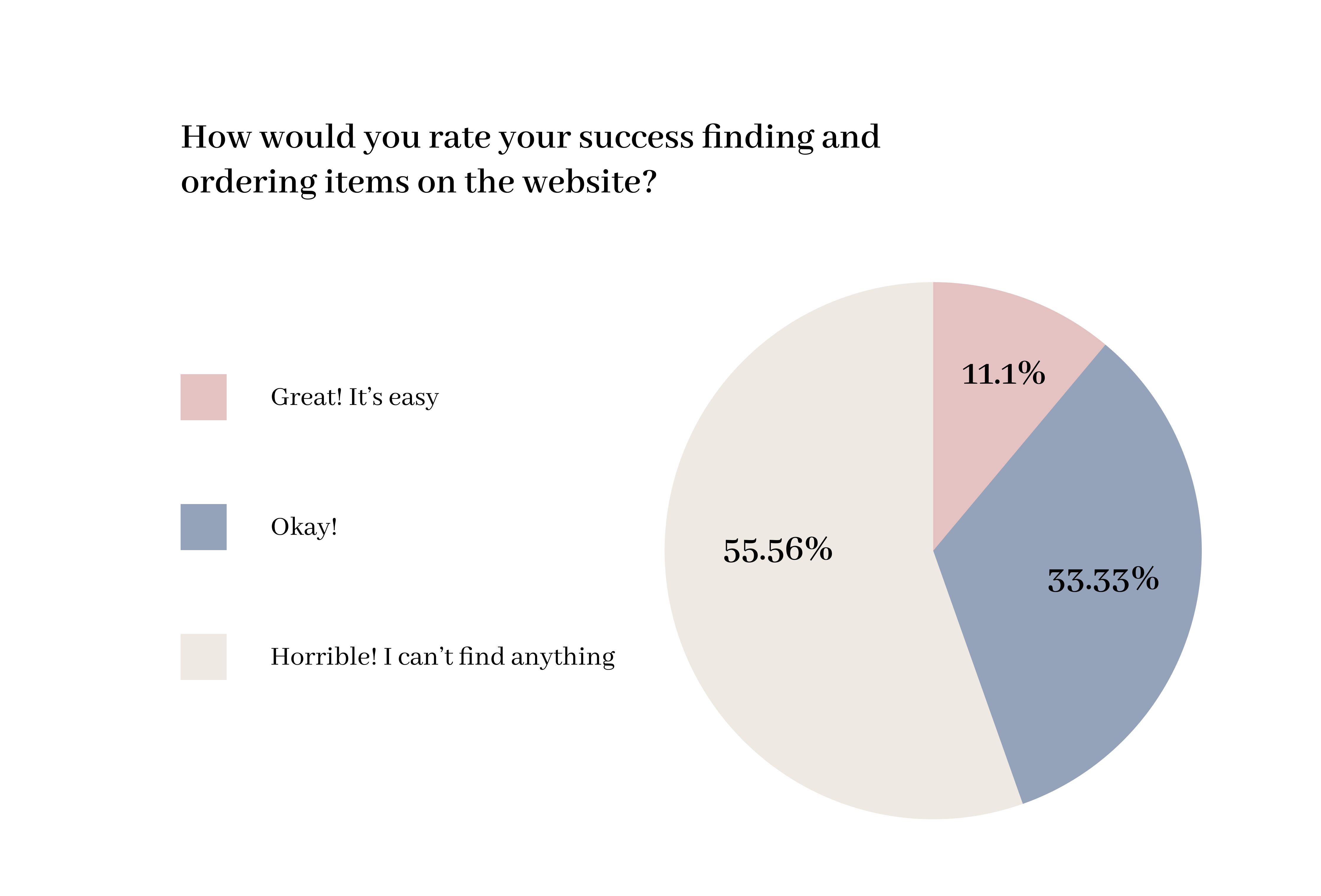
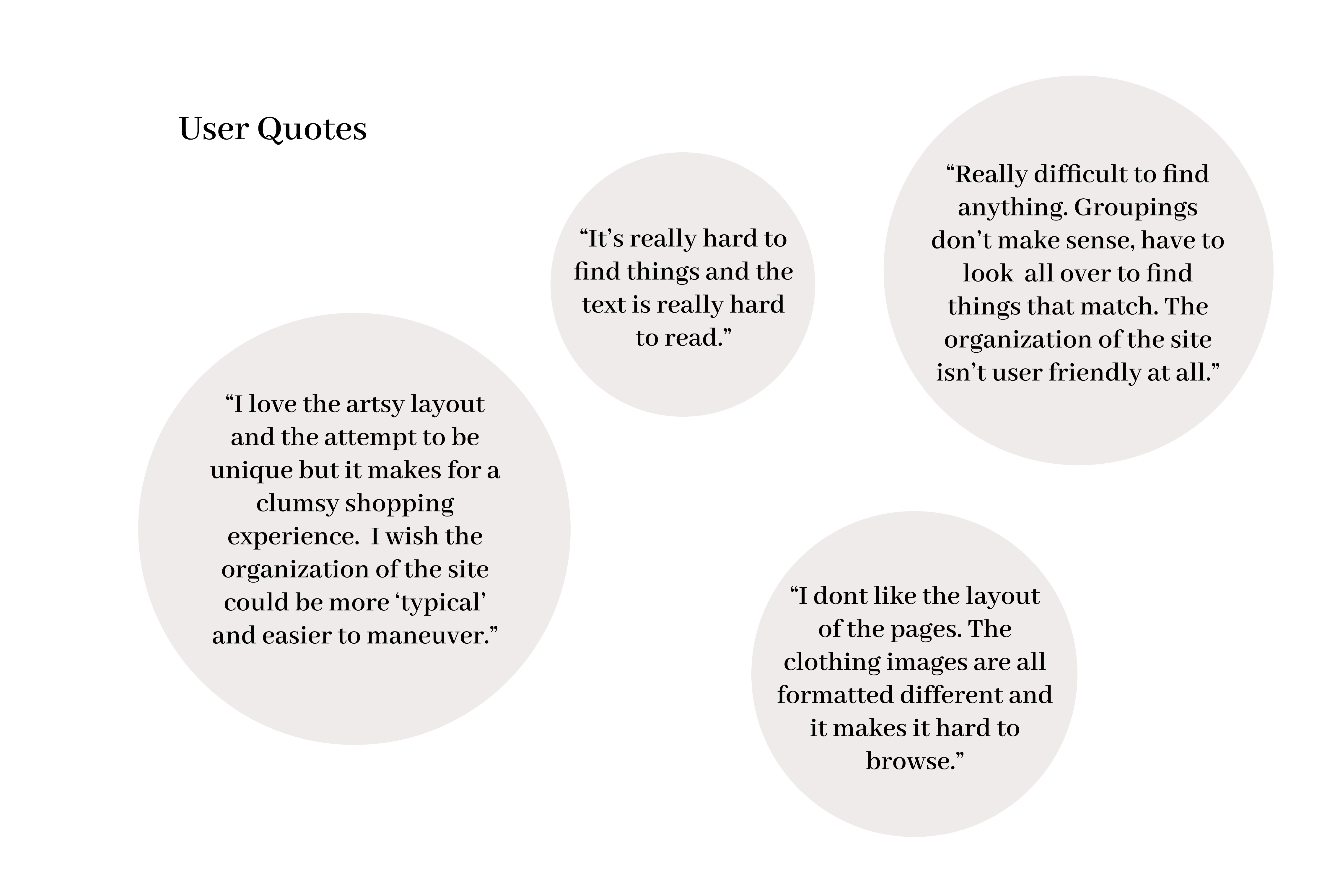
After completing the heuristic evaluation, I wanted to hear from real Zara users to see how the failed heuristics affected their experiences. I published a survey and posted the link on my social media and Amazon Mechanical Turk. There were no limitations regarding who could participate, as long as they had shopped on the Zara website before.
*Due to time limitations and financial constraints, only 27 responses were collected, making the survey statistically insignificant.
After compiling the data from my research, I created a persona to represent Zara’s main user group.
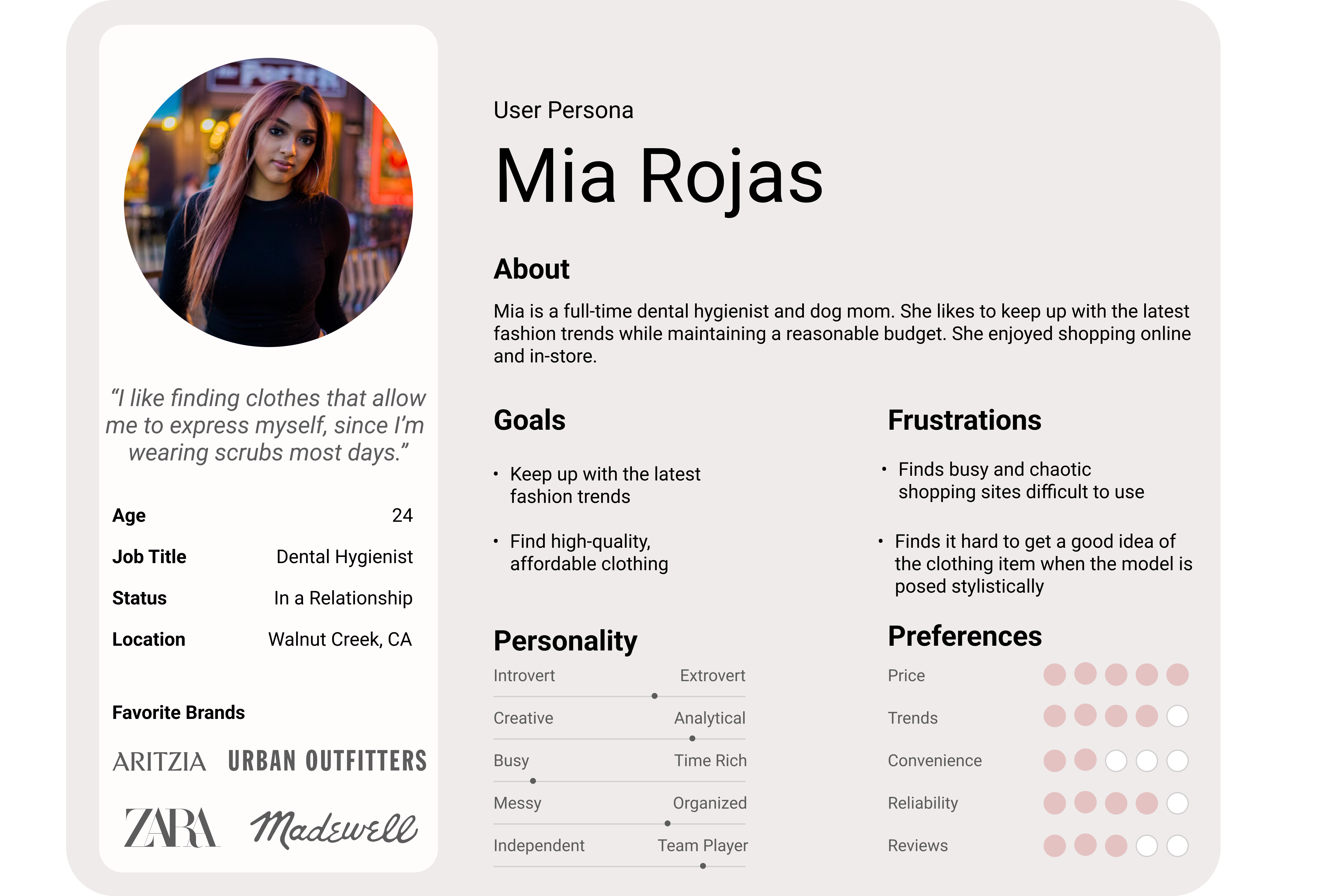
The findings from this study show poor usability for the Zara website. The majority of the heuristics defined by the Nielsen Norman Group were ranked poorly, causing a negative user experience. The survey showed that the majority of tested users find the website difficult to navigate and often find their shopping experiences on the website unsuccessful due to the interface. The website is not meeting the needs of the persona, Mia, as she is frustrated by chaotic and difficult-to-use shopping sites and finds it difficult to get an accurate idea of what an article of clothing looks like on artistically posed models. Though the website is aesthetic and reminiscent of a fashion catalog, it does not meet the needs of its users.
My findings suggest there needs to be a redesign of the website. The information architecture is one of the primary pain points of users. Conducting card sorting and tree testing would help inform the redesign of the site’s navigation system. Additionally, creative content on the site, like image format and typography, do not adhere to industry standards and best practices, causing a negative user experience. The redesign needs to consider the design heuristics and visual designl principles in order to create a positive user experience.