.png)
EResponse is a mobile healthcare app that helps users determine whether or not they need to visit an emergency room. Using messaging, video chat, and AI technologies, EResponse will save users time and money and allow them to avoid unnecessary trips to the ER.
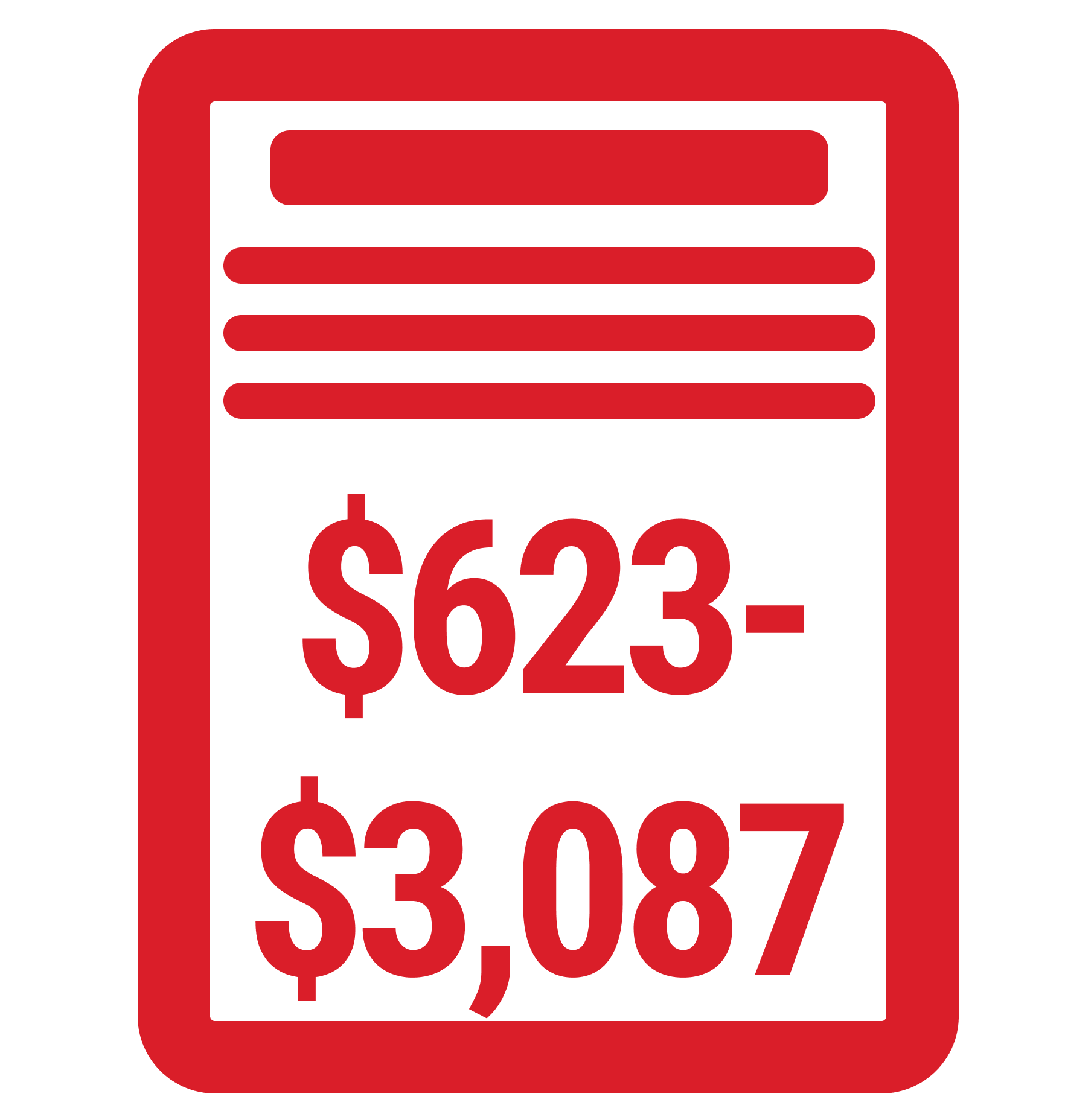
Emergency room visits are incredibly stressful, time-consuming, and costly. According to the CDC,
the average ER visit in the United States takes
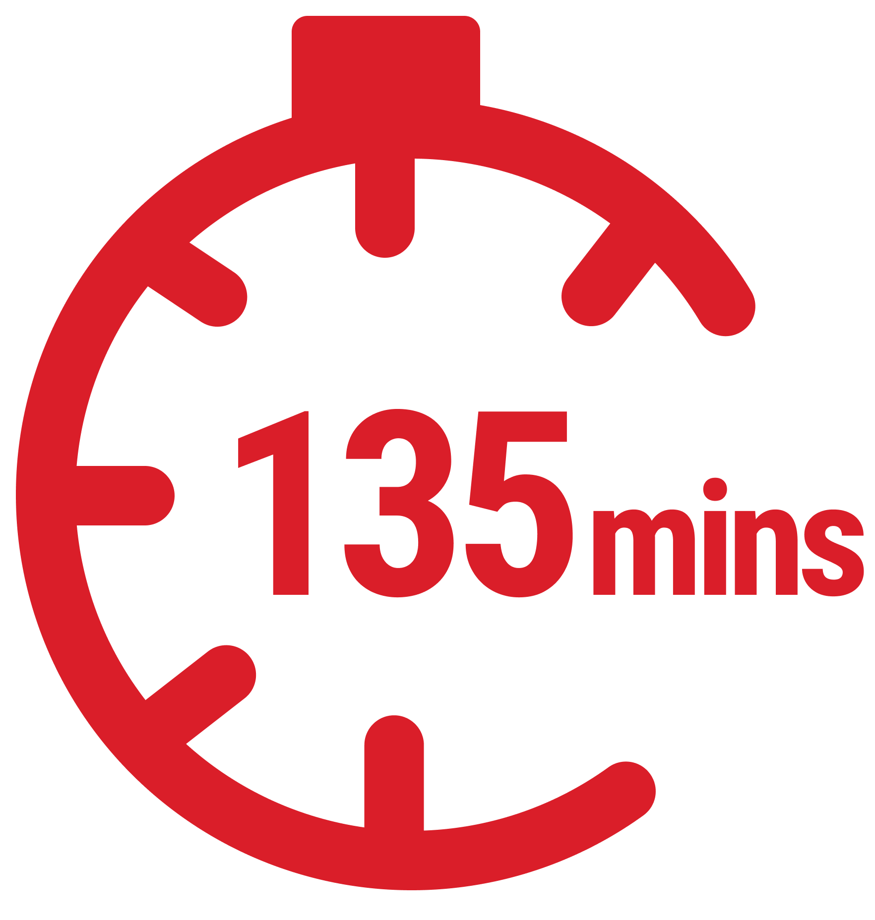
and costs between
While there are existing products on the market for messaging primary care physicians and insurance providers, there is a lack of easily-accessible and universally available chat services that allows patients to confirm whether or not their symptoms warrant an ER visit.
We intend to create a mobile app where patients can message with an AI bot and healthcare providers to determine whether or not an emergency room visit is advised.
Our product will utilize messaging, video chat, and AI to reduce ER visits for users. This will save users time and money while avoiding the stress of visiting the ER. Not only will this product benefit our users, but over time we hope to see a reduction in emergency room overcrowding, alleviating strain on hospitals and healthcare providers across the United States.
We created a very simple persona to define our target user. Our audience is very broad, including anyone who is experiencing medical symptoms and is unsure if they should visit an ER.
%20copy.png)
Creating a context scenario allowed us to visualize the user’s problem, show how interacting with our product could help, and define the project goal.
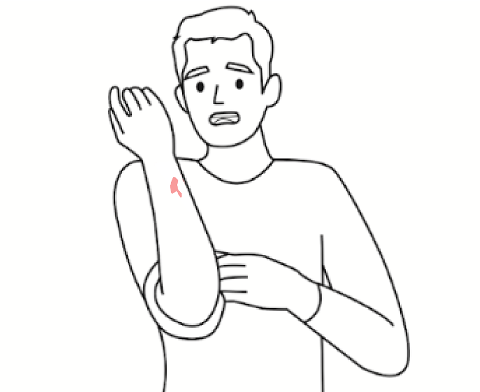
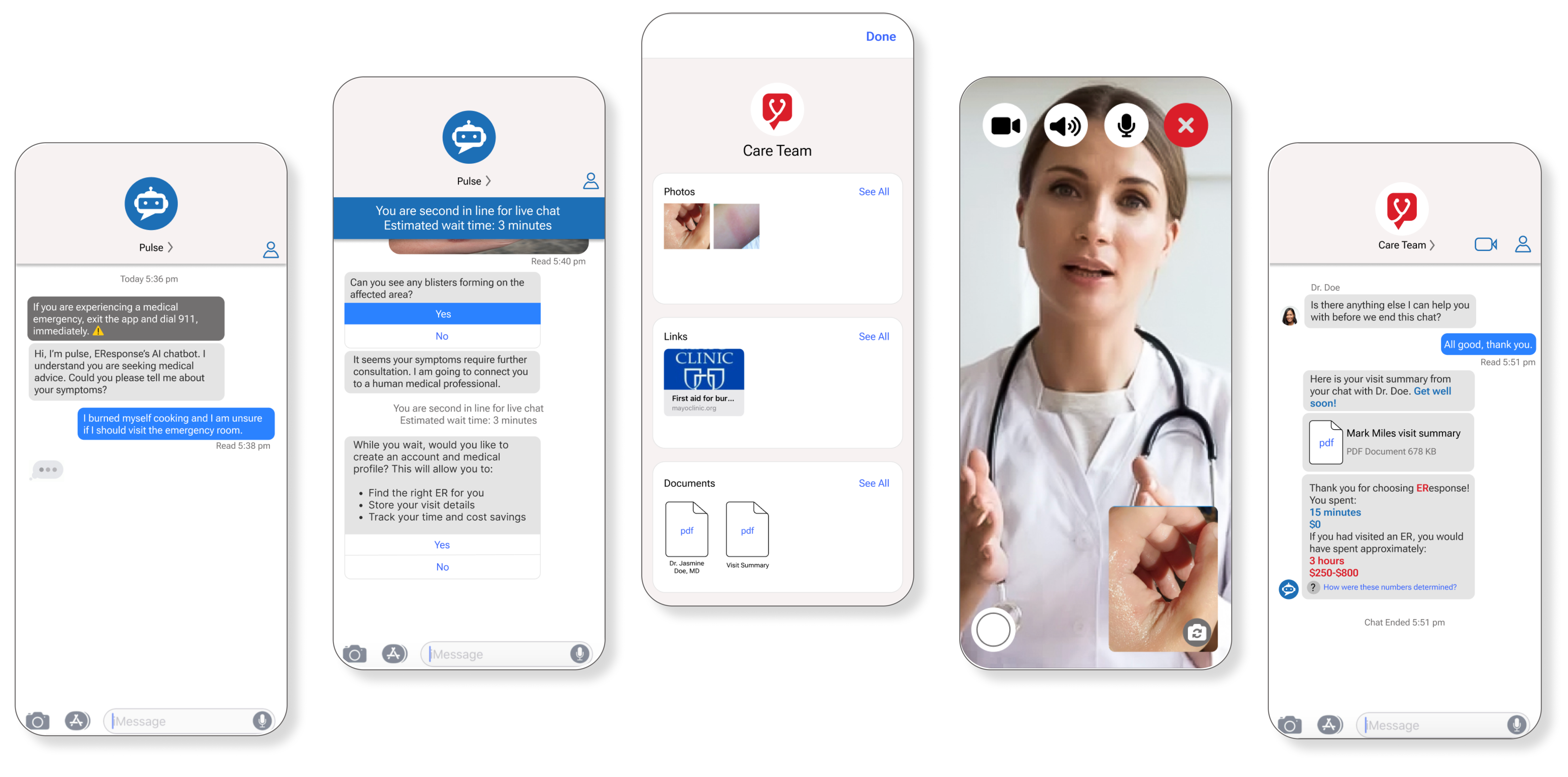
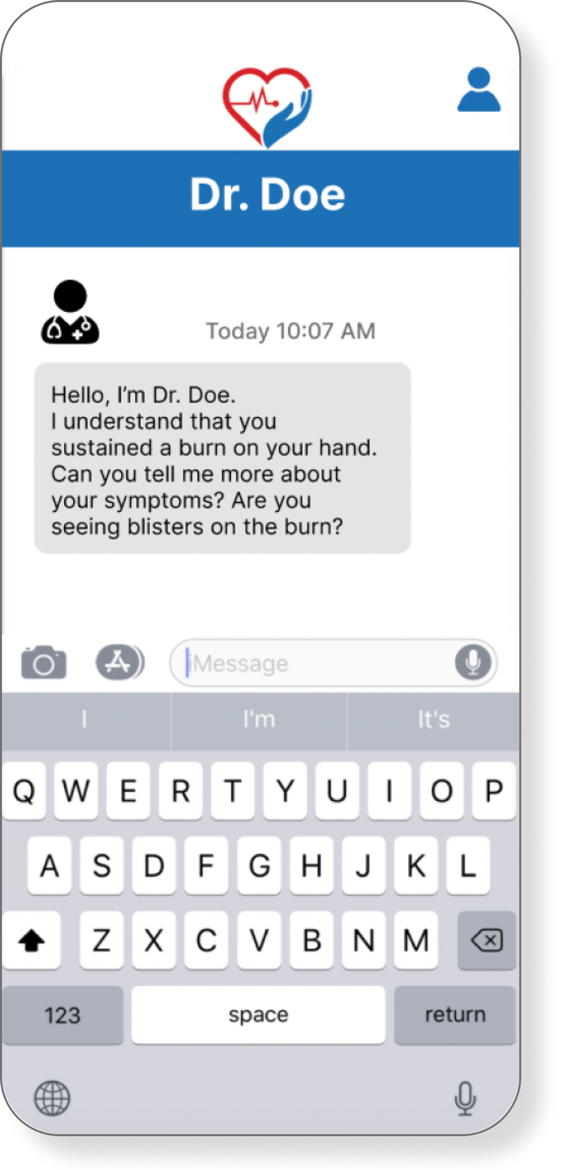
Mark sustained a burn 12 hours ago while cooking and he is not sure whether or not he needs to go to the emergency room. He would like to avoid the trip to the ER, as well as the cost if it is not necessary.
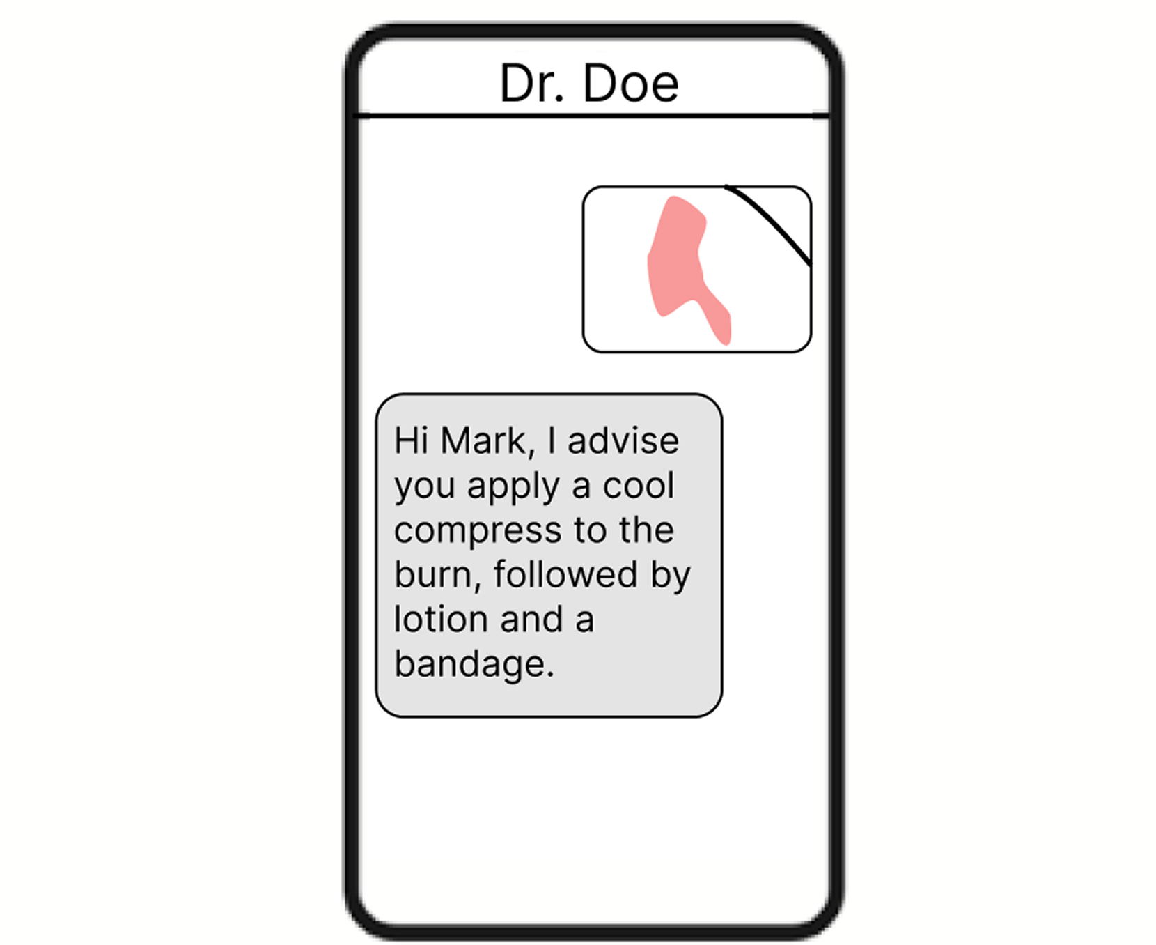
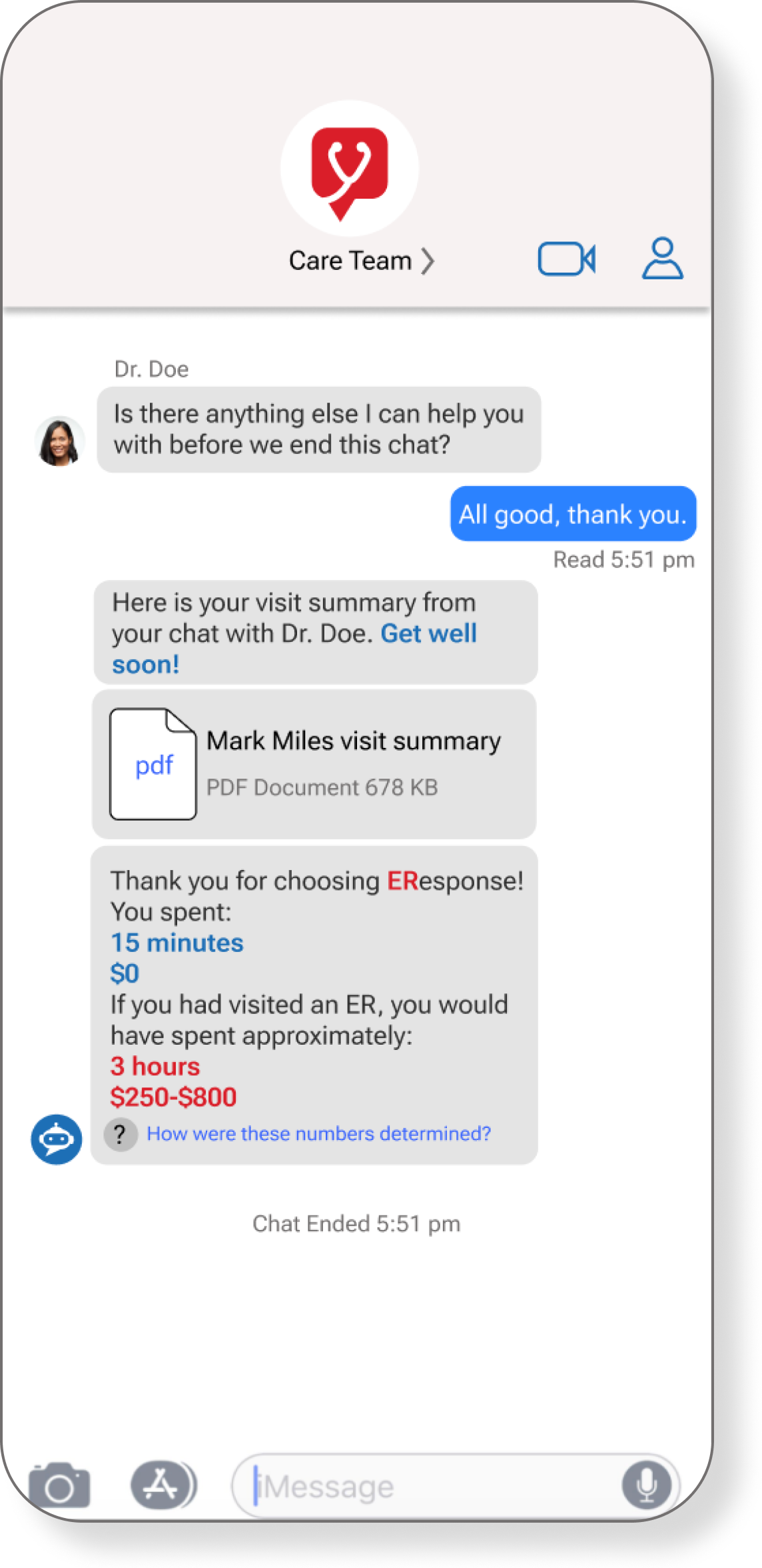
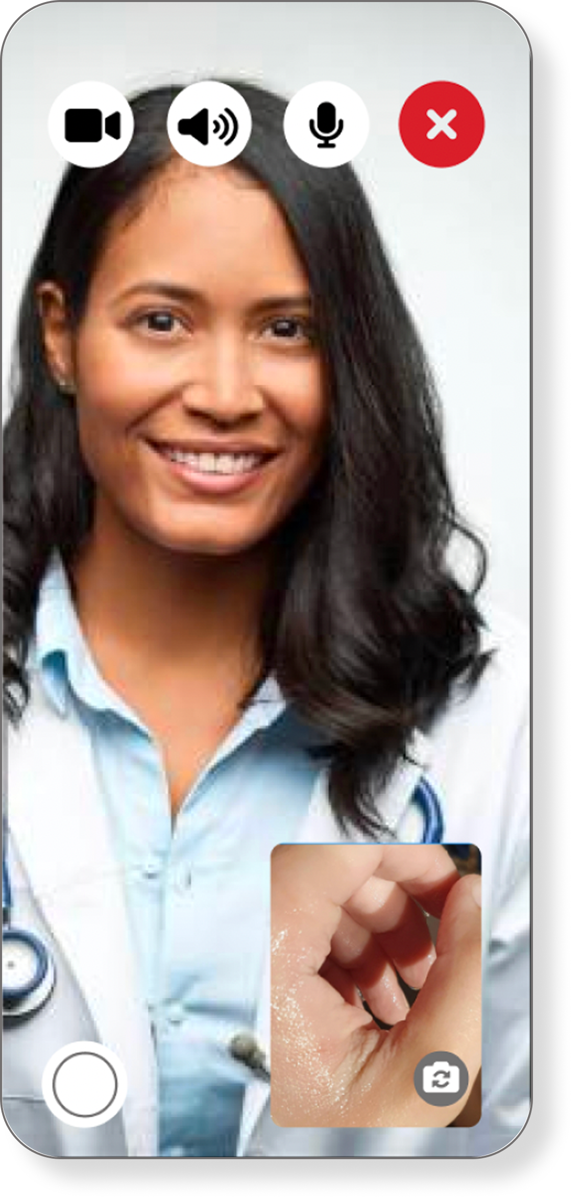
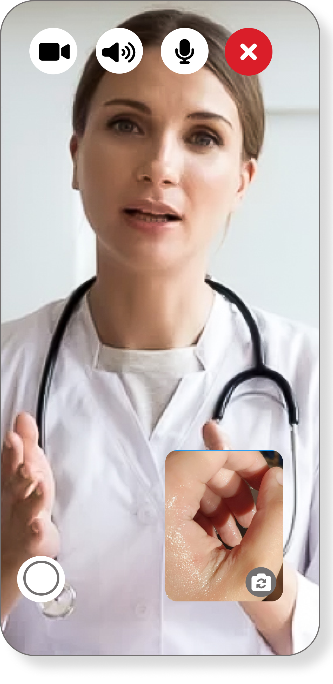
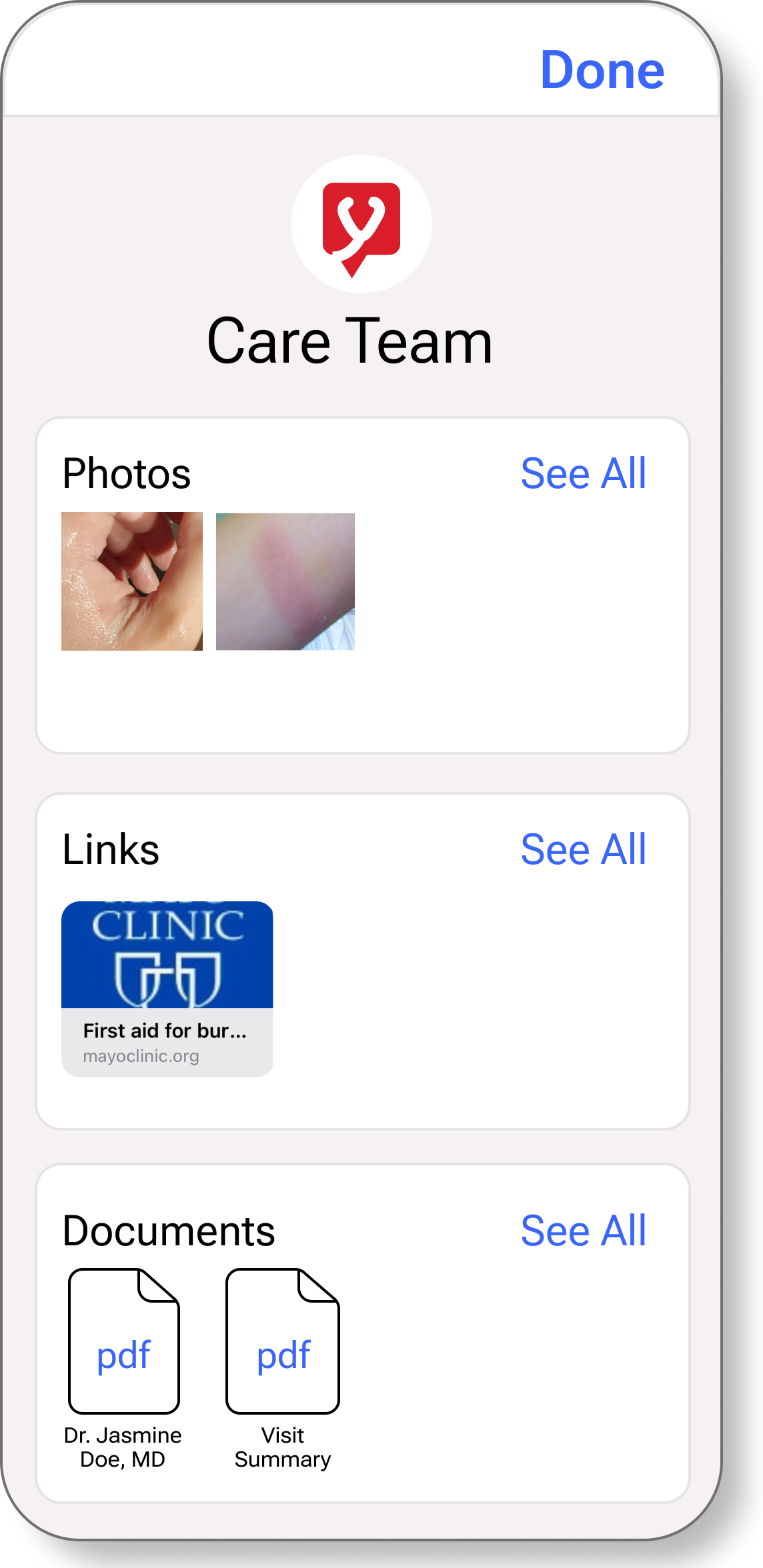
Mark chats with Dr. Doe through the EResponse mobile app. By utilizing the photo sending feature, Mark is able to receive advise from Dr. Doe about how to handle his injury.
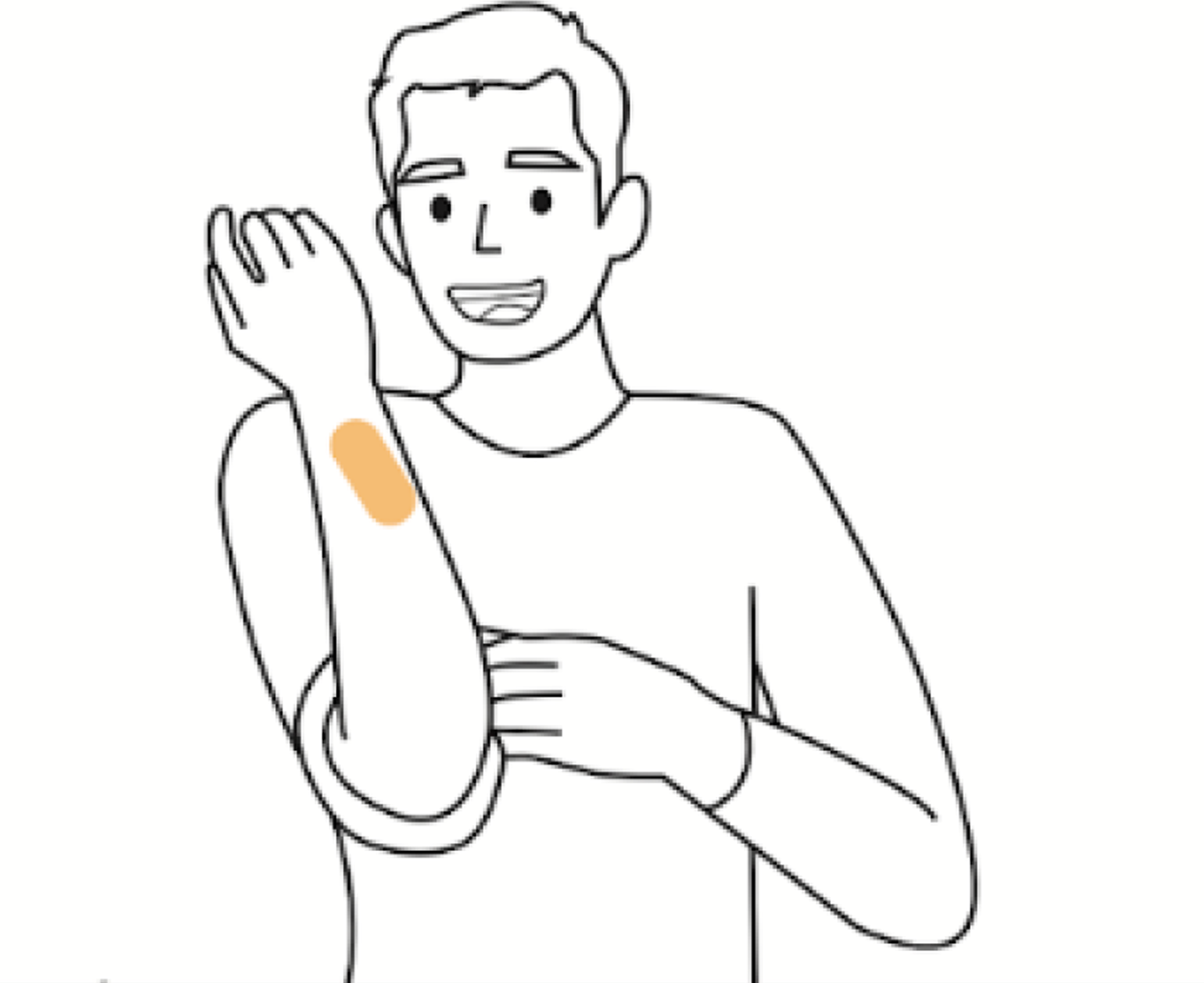
Mark feels relief from his pain after following the treatment plan given by Dr. Doe and he is so happy he didn’t spend hours and hundreds of dollars at the ER.
.png)
With the information from our preliminary research and context scenario, we drafted low-fidelity napkin sketches of our initial ideas. We tested several screens and decided to move forward with the three concepts that were most successful in testing.
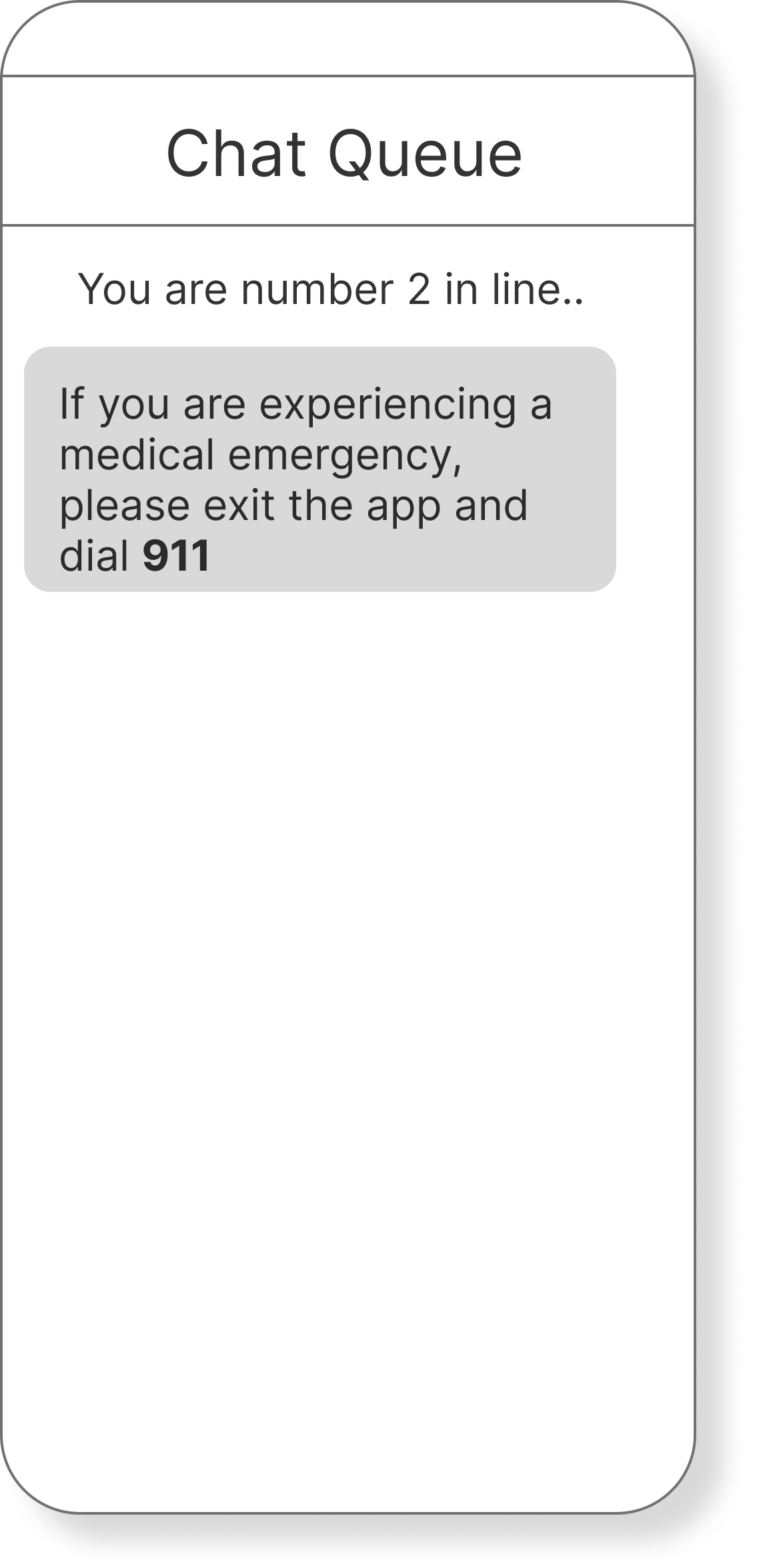
The automatic 911 disclaimer message tells users that if they are experiencing life threatening symptoms, they should call 911 immediately.
Disclaimer should happen at the start of the experience
Position in the chat queue is valuable
The photo sharing feature allows users to share photos with the medical professional to receive more accurate care.
Photo feature is good
Video chat feature would be better
The non-emergency care advice feature would occur once the medical professional determined that an ER visit was not necessary.
Tone of voice is off-putting
There should be more questions asked before proposed solutions
After testing, we created a user journey map to help us fully understand the user process from beginning to end.
We created a user task flow that shows the journey a user would take to complete the journey. We gathered insights from our user journey map to help create an easy and intuitive experience for completing tasks.
While we were making the task flow, we were also working on block wireframes. This process helped us to develop a low-fidelity visual hierarchy of our screens. Leaving features as different sized blocks allowed us to focus on how much space everything would take up, rather than what everything would look like in the final prototype.
The discovery and exploration work gave us the information to start developing mid-fidelity screens. After creating the wires, we tested them and made an issue prioritization matrix to better understand what we needed to improve the most. The following wireframes scored as the most impactiful in the issue prioritization matrix.
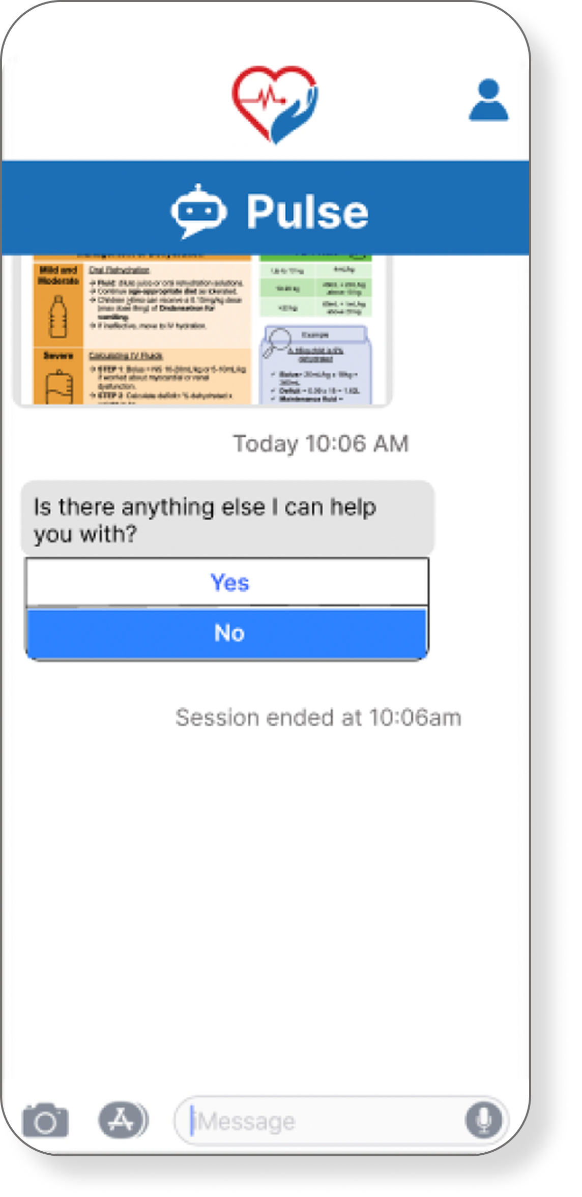
Unsure how to read the graphics
Want to know how much money was saved
Too much typing required
Would prefer to talk and show symptom over video chat
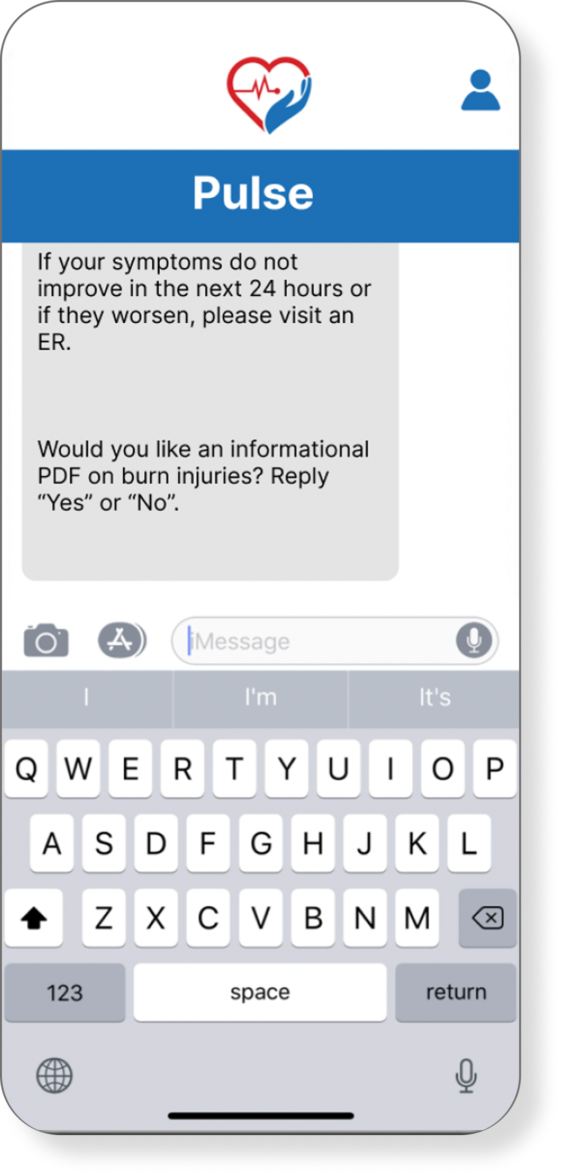
Does not want to type yes/no reply for PDF
Wants medical advice and PDF question in separate texts.
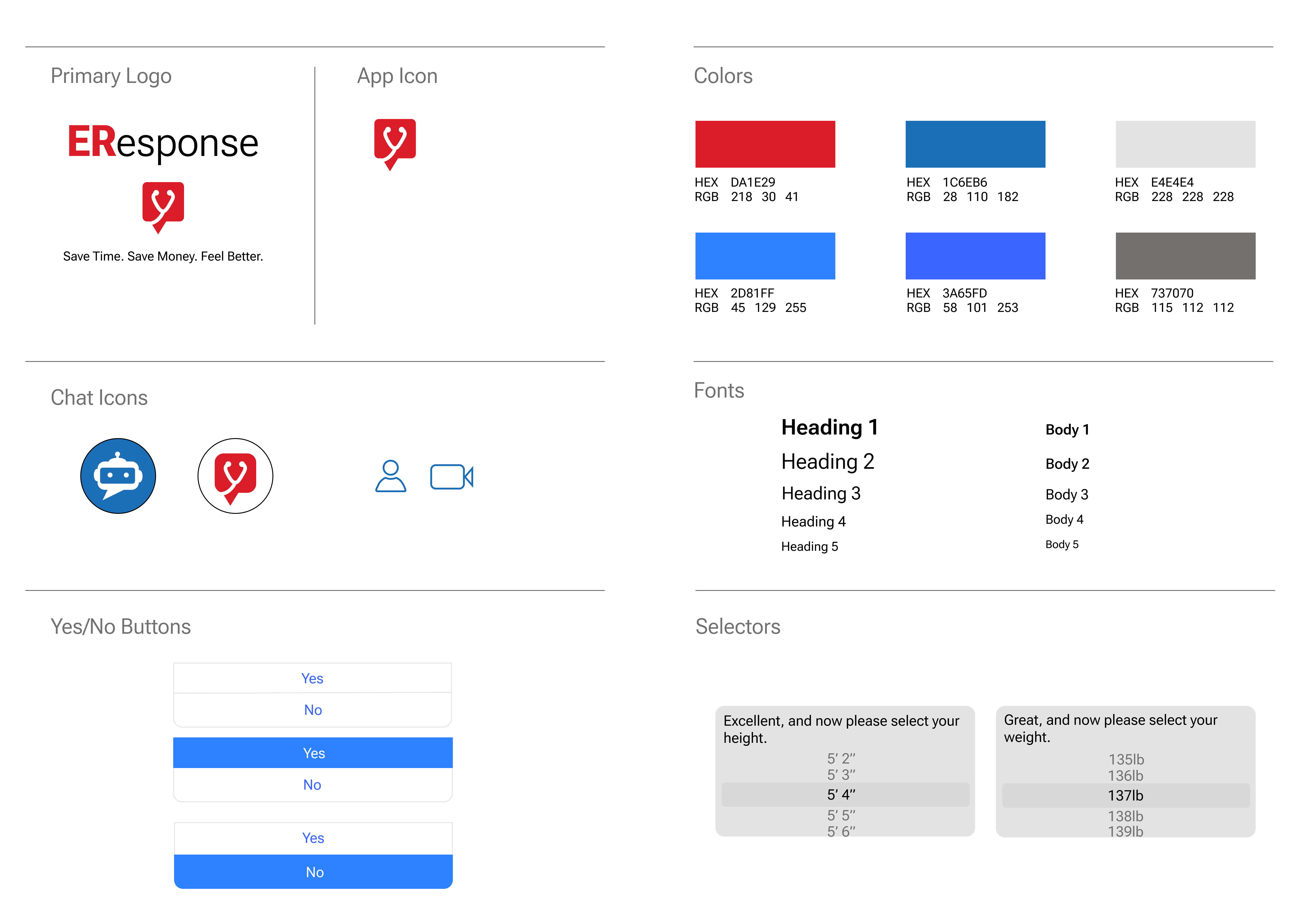
After the second iteration, we created a style guide to create a visually-cohesive experience.